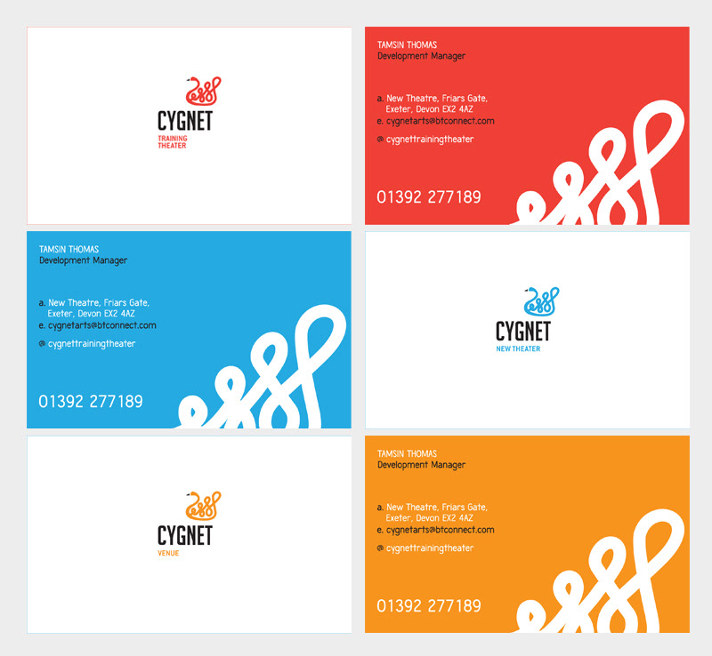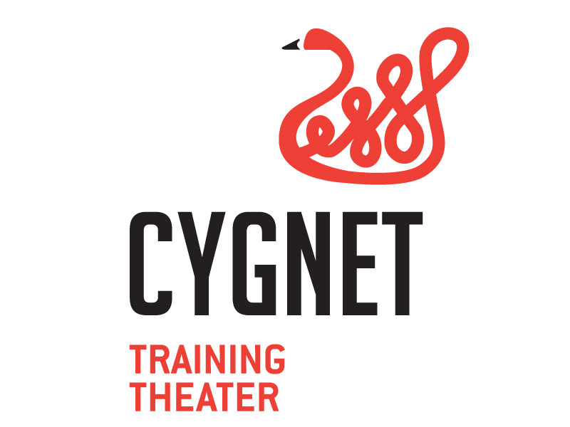
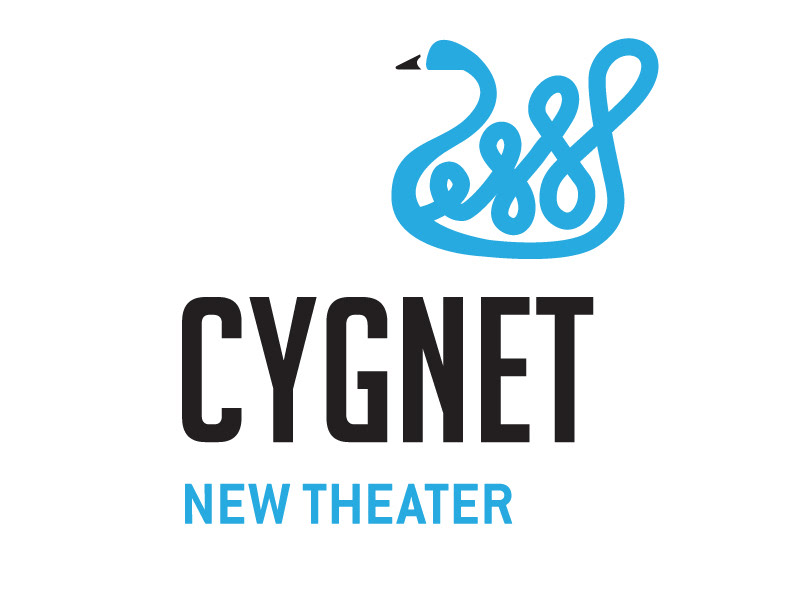
This is my proposal for the logo of Cygnet, a theater company, training center and venue. Their former logo was a swan and they wanted to keep the symbol. I based the design in a more cutting edge icon with strong strokes and dynamic shape. One of the challenges, the three different branches of the client (company, venue and training center) were clearly identified by linking each of them with a color and a headline. I used a font with strong personality and bold character.


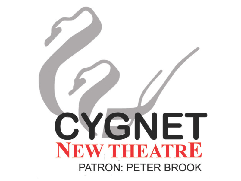
This was the original logo. The client wanted to keep the concept of the swan and improve it to offer a cutting edge image to engage the three different audiences they have: students for their courses, professional staff for the company and public for their shows.