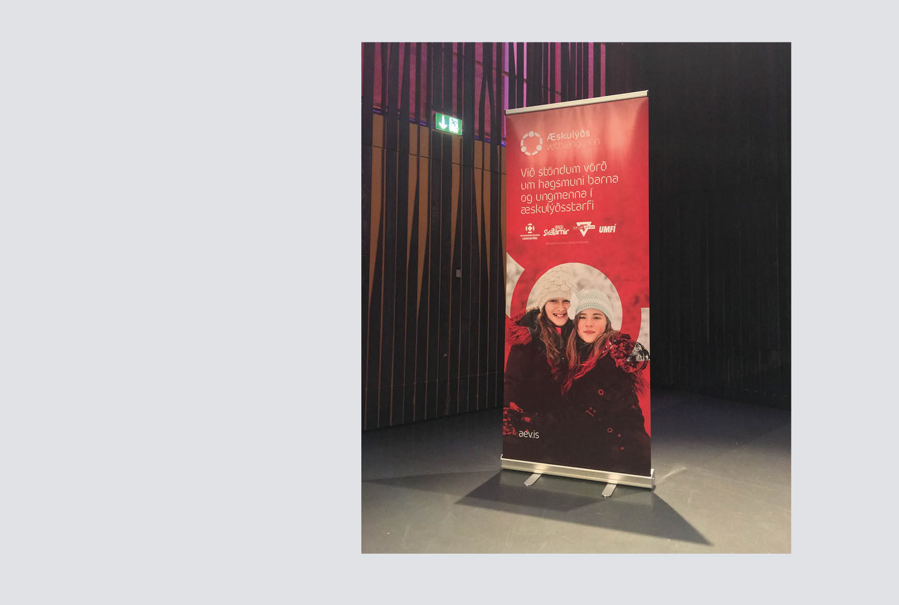
Rebranding for the Forum of Youth in Iceland, Æskulýðsvettvangurinn.
This Forum is formed by four organizations working to safeguard young people's interest and promote a healthy foundation for working with youth.
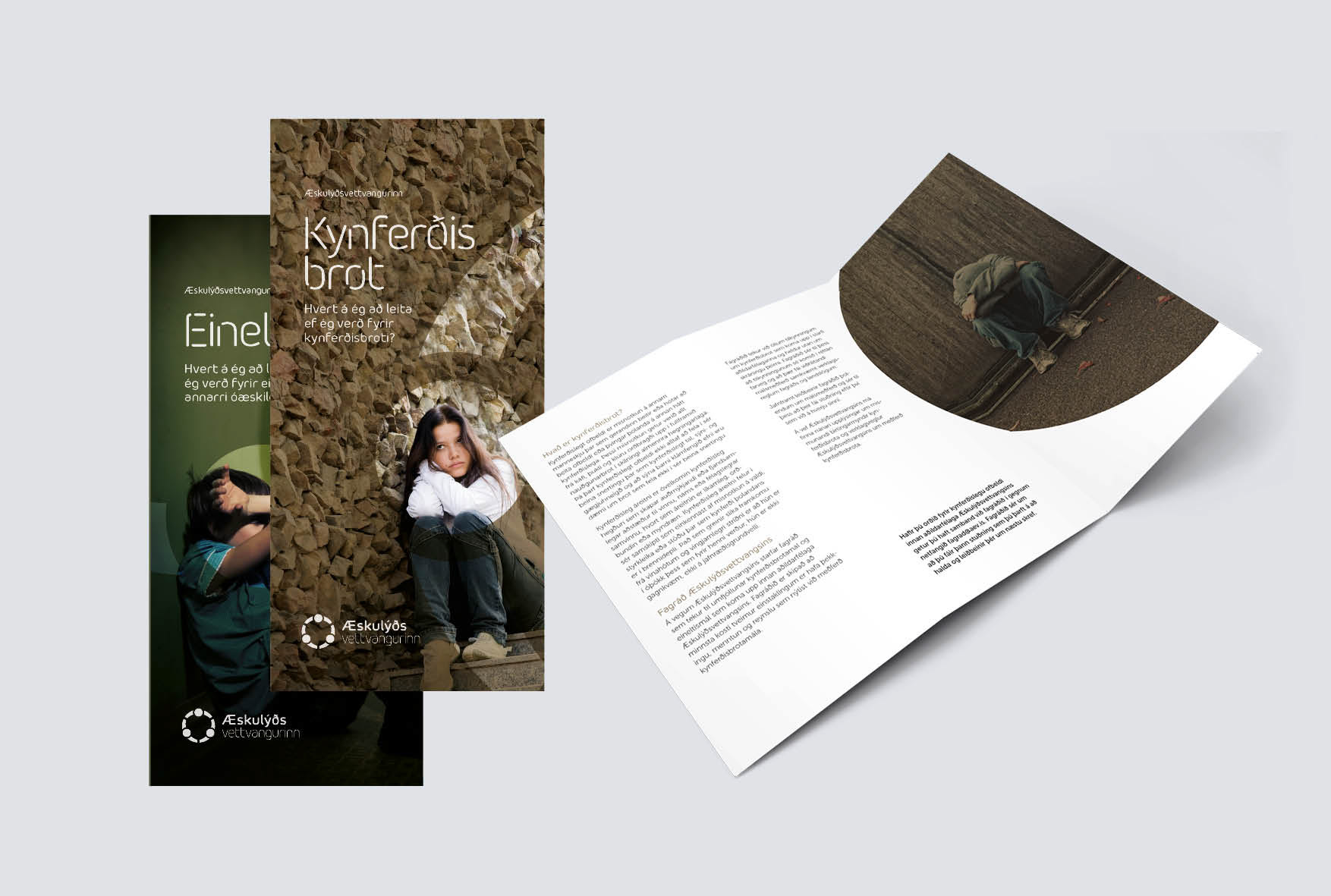
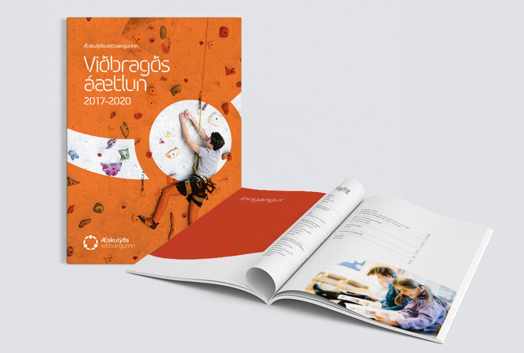
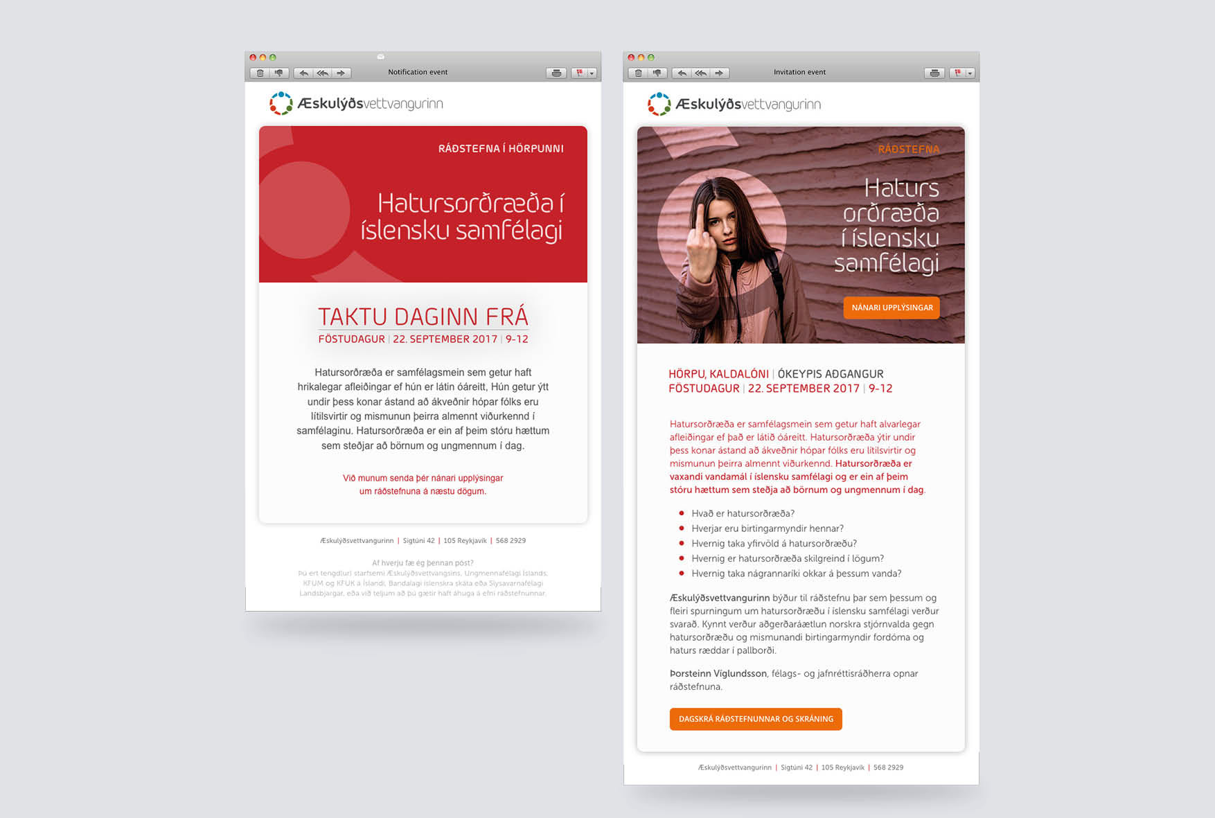
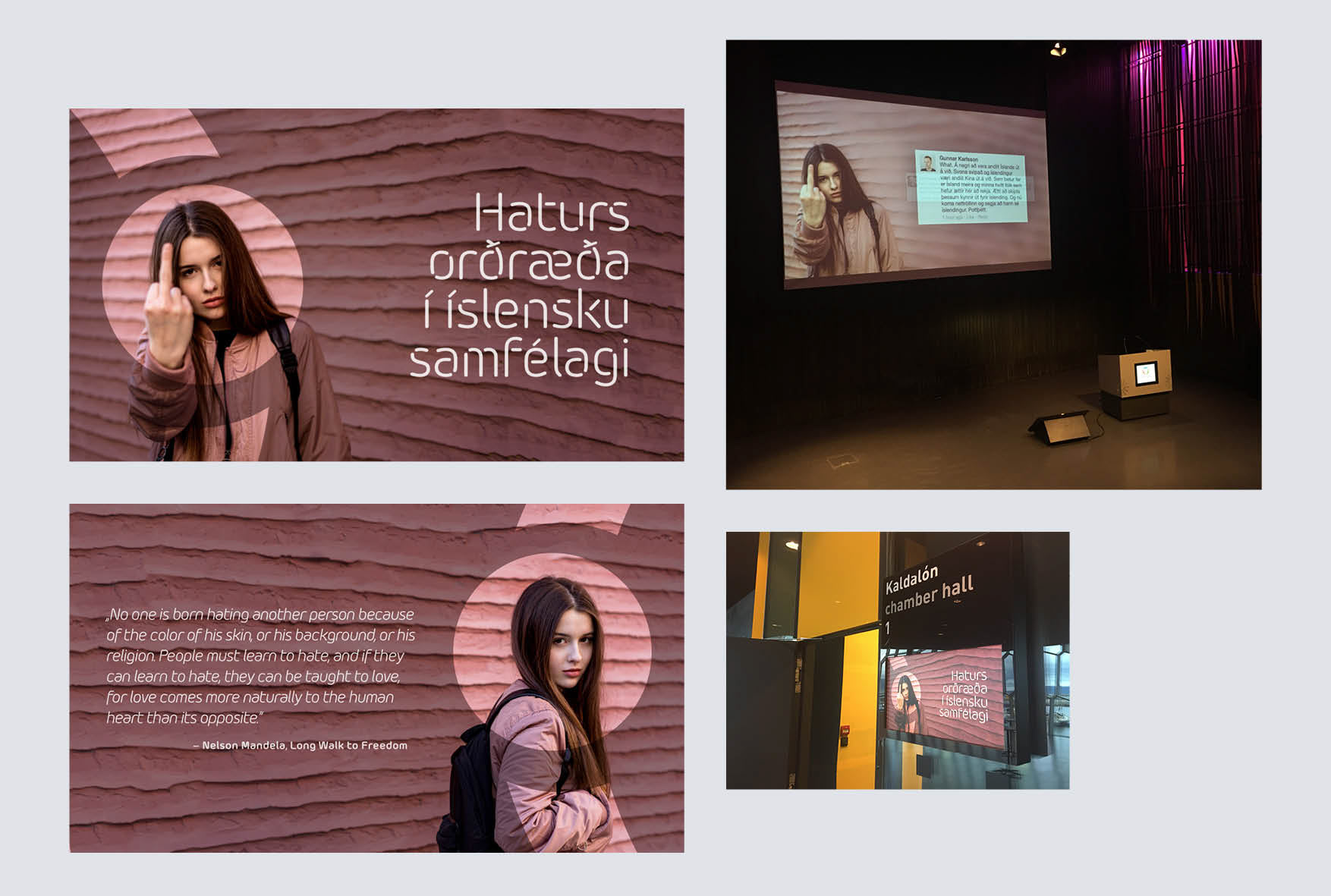
Working together with the company Fínlína in Iceland, we built a single strong brand from the existing one. Using bold uplifting colors, a unique typeface, and a distinctive use of the graphic symbol, we took the brand to the next level, creating a strong, consistent and clean visual presence.
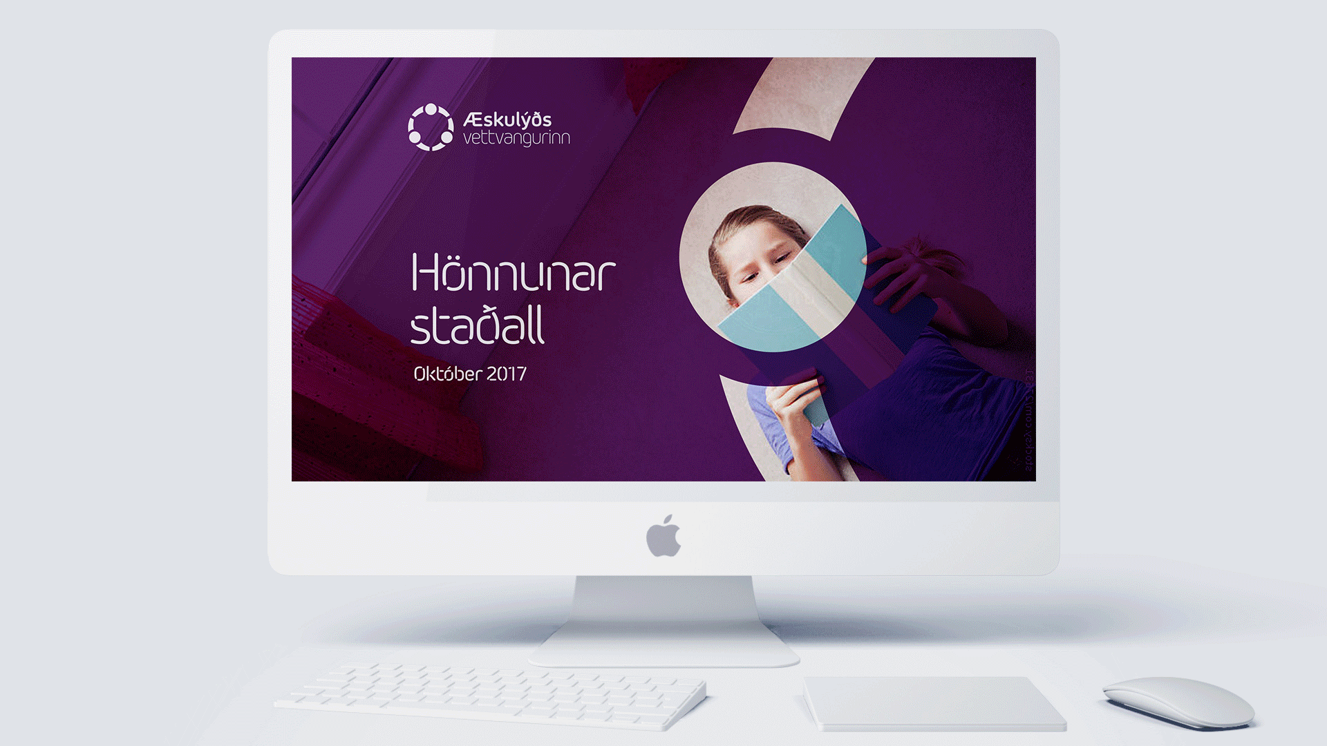
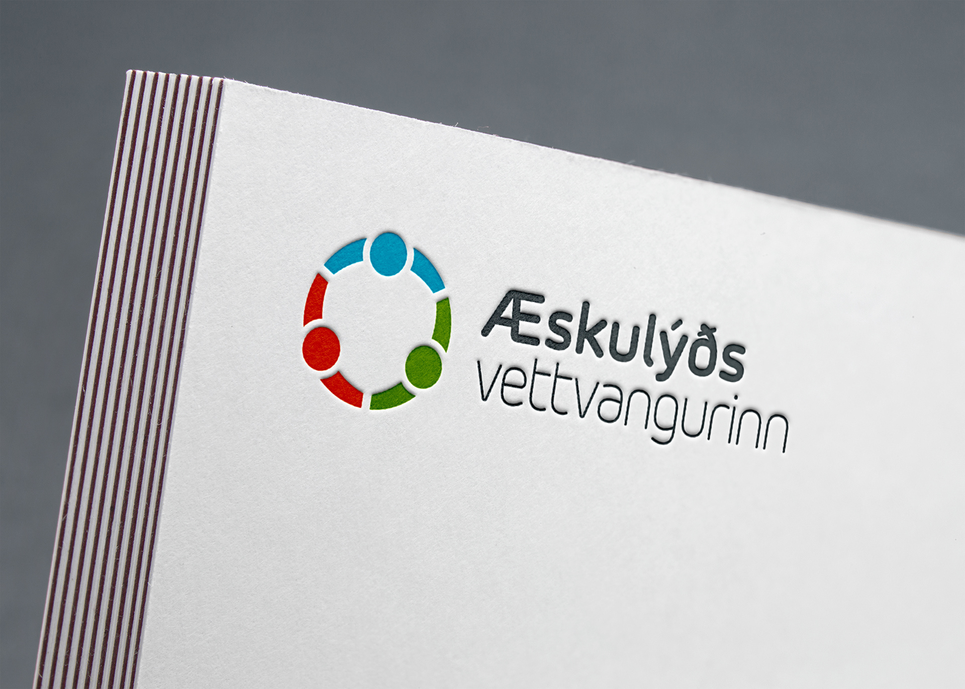
We took the initial logo and refined it into an updated graphic symbol. Using circles as a theme in the brand, we expanded the visual spectrum of the forum into a strong presence that is consistent throughout digital, print and 3D formats.